Route Planner Redesign

Marked

Product Designer

B2B + B2C project

Overview

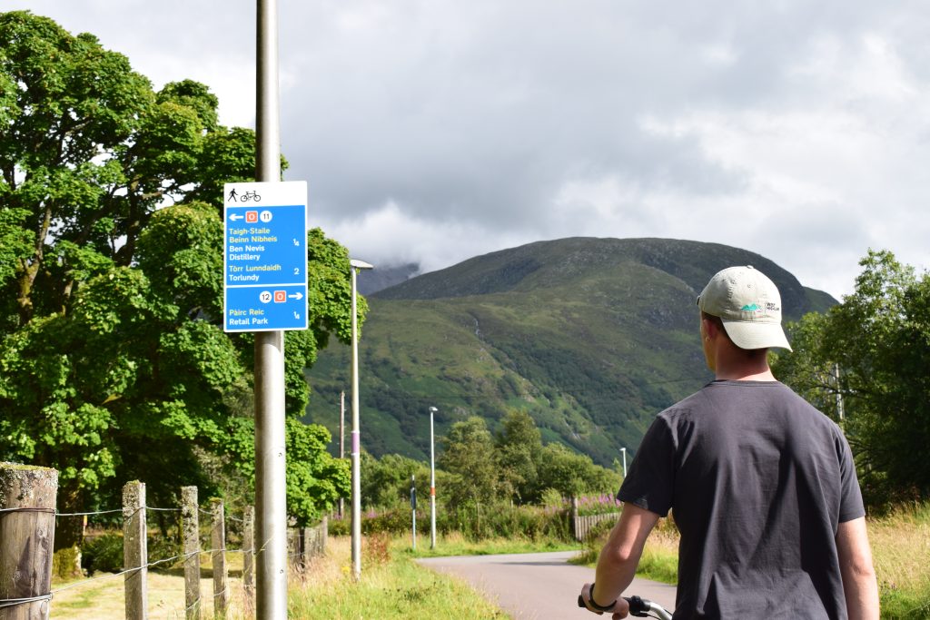
Marked wayfinding is a colour-coded, safe cycling and walking network for Fort William, Scotland, aimed at promoting active travel and connecting the city.

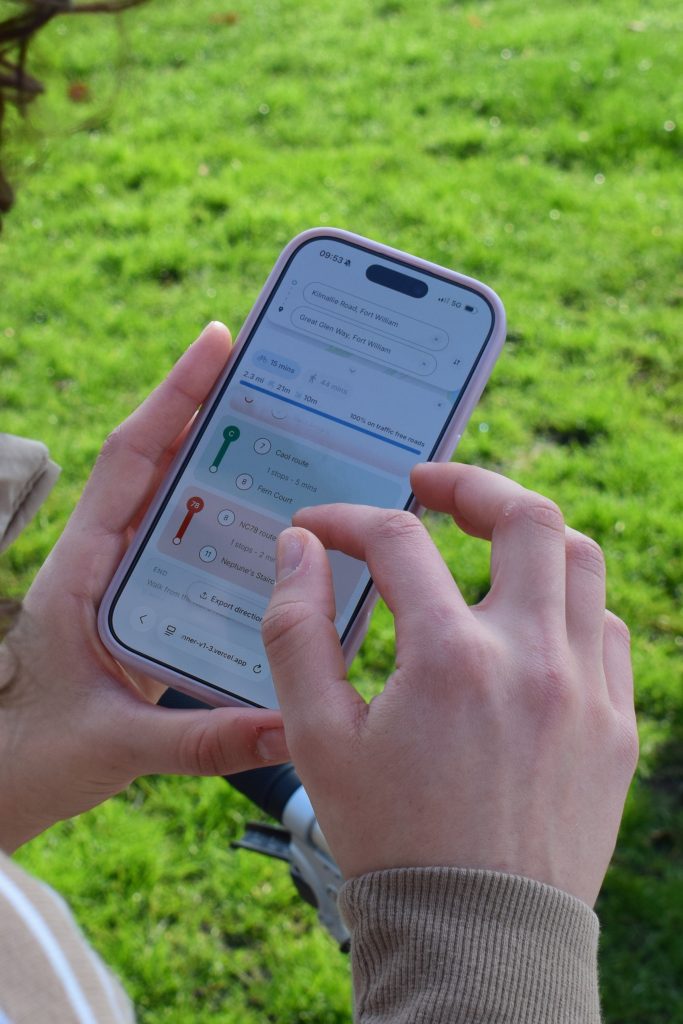
As the sole Product Designer at Marked, I led the end-to-end design, from the physical signage to the redesign of the project’s initial Journey Planner web app. Guided by extensive user research and iterative testing, the final solution delivered an intuitive experience where users could confidently navigate using either the signage, the web app, or a combination of both.
Problem

Outdated Signage

Fort William’s cycling and walking network felt disconnected, as the wayfinding was outdated

No reliable digital data

No online maps had the data to help users navigate the cycling routes Fort William had to offer

Designed for the wrong users

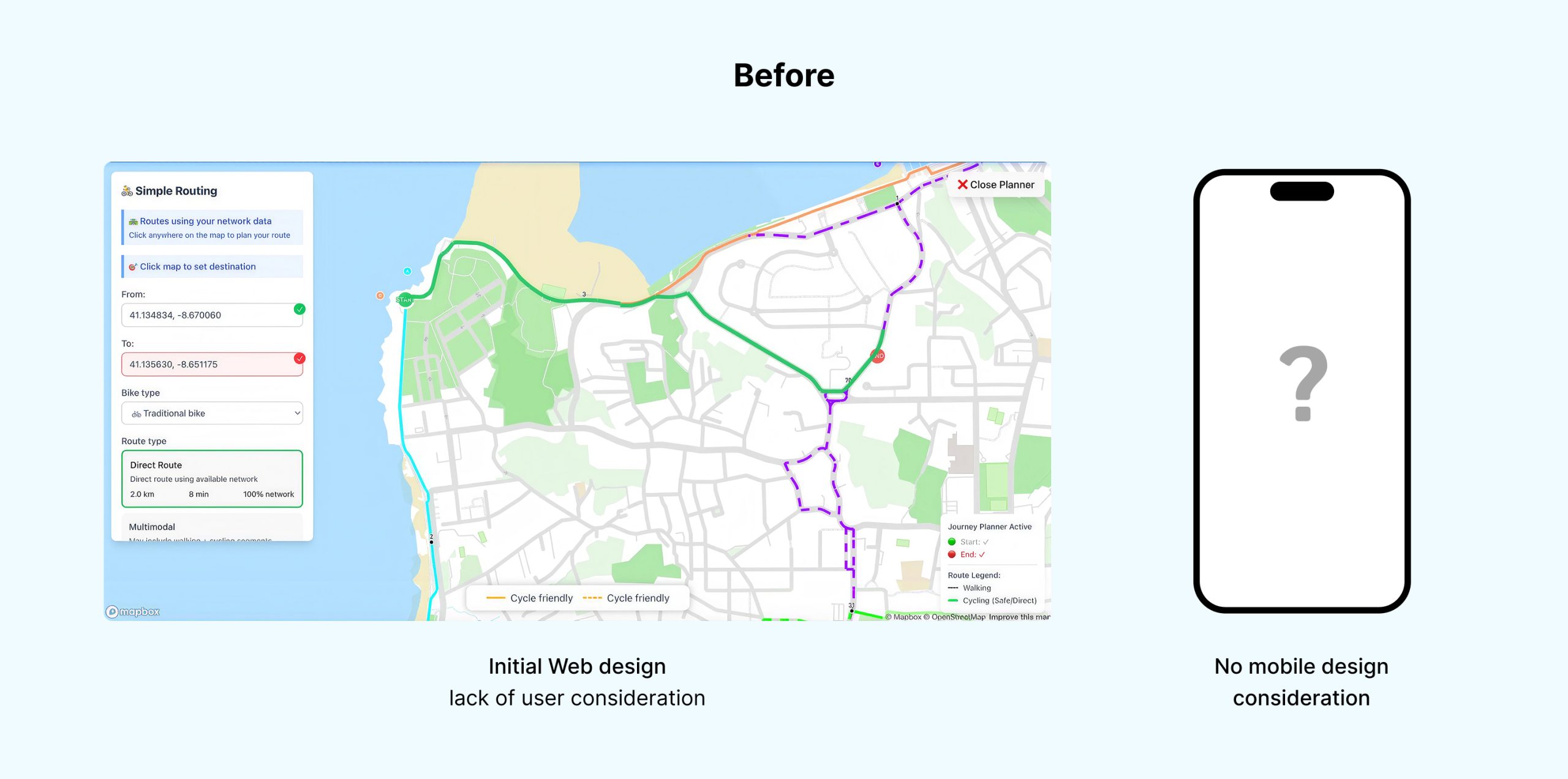
The initial planner lacked user understanding and was designed around assumptions of its users

Aim

Helping Fort William with Hi-Trans (a bike rental company in the Highlands) create a better-connected city through our colour-coded wayfinding concept, paired with the data needed to make these routes digitally accessible and user-friendly 

Challenges

Web app only platform

The route planner had to be built as a web app, with no downloadable app option

Colour & number navigation

Routes had to be colour-coded and follow a node-number system, which can increase complexity 

Solution

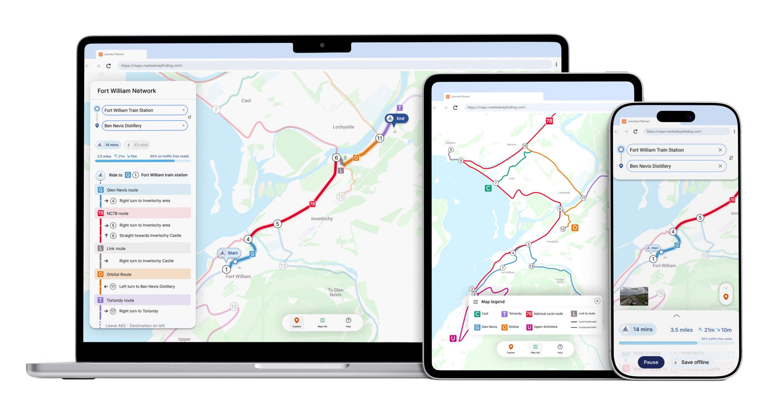
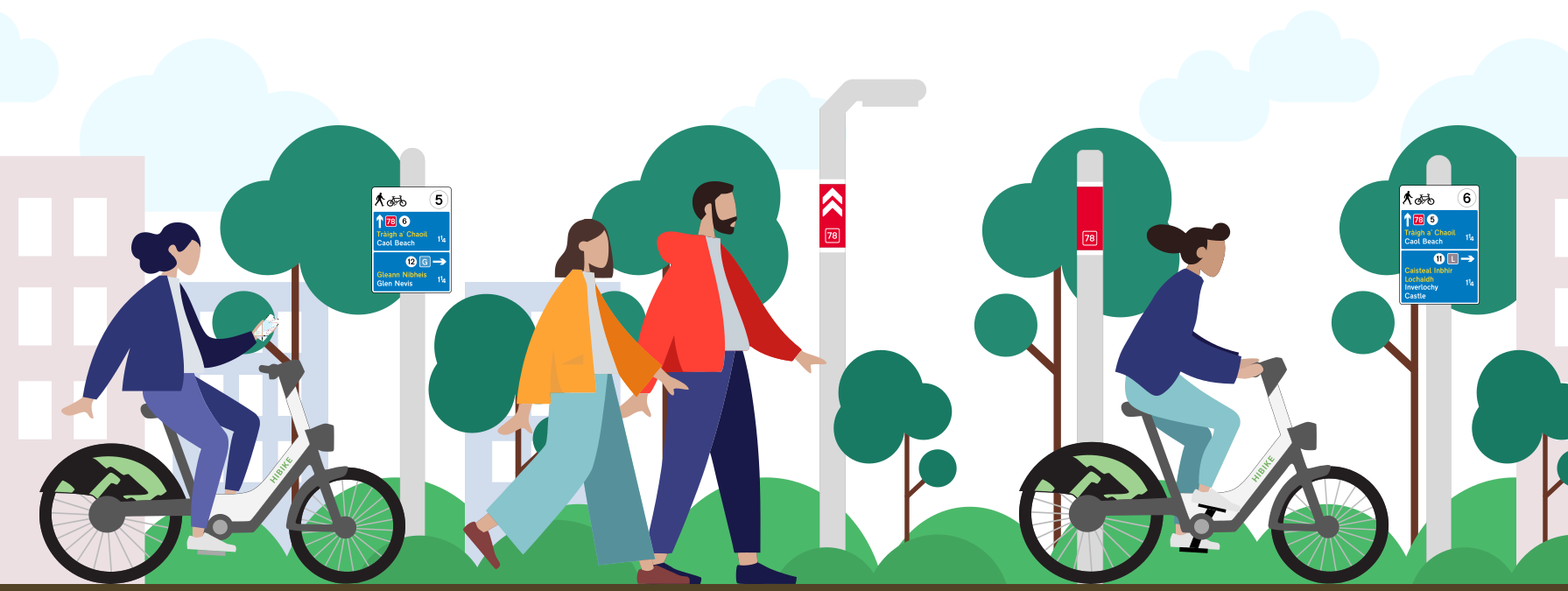
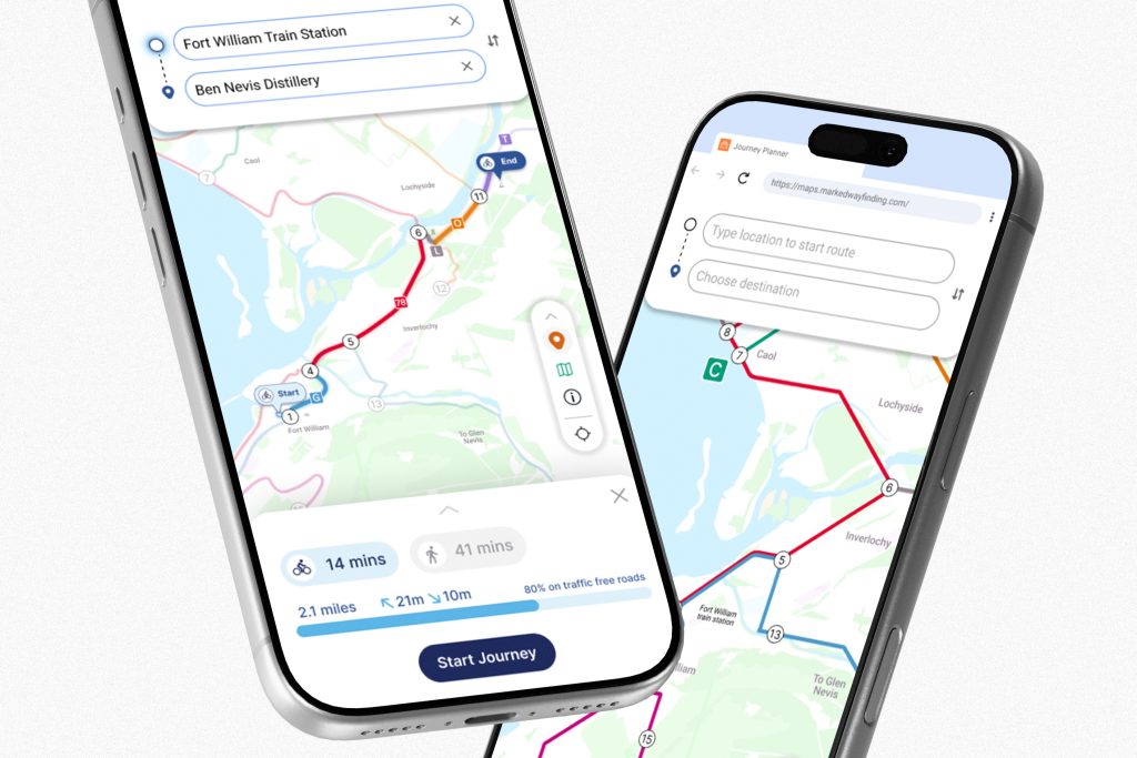
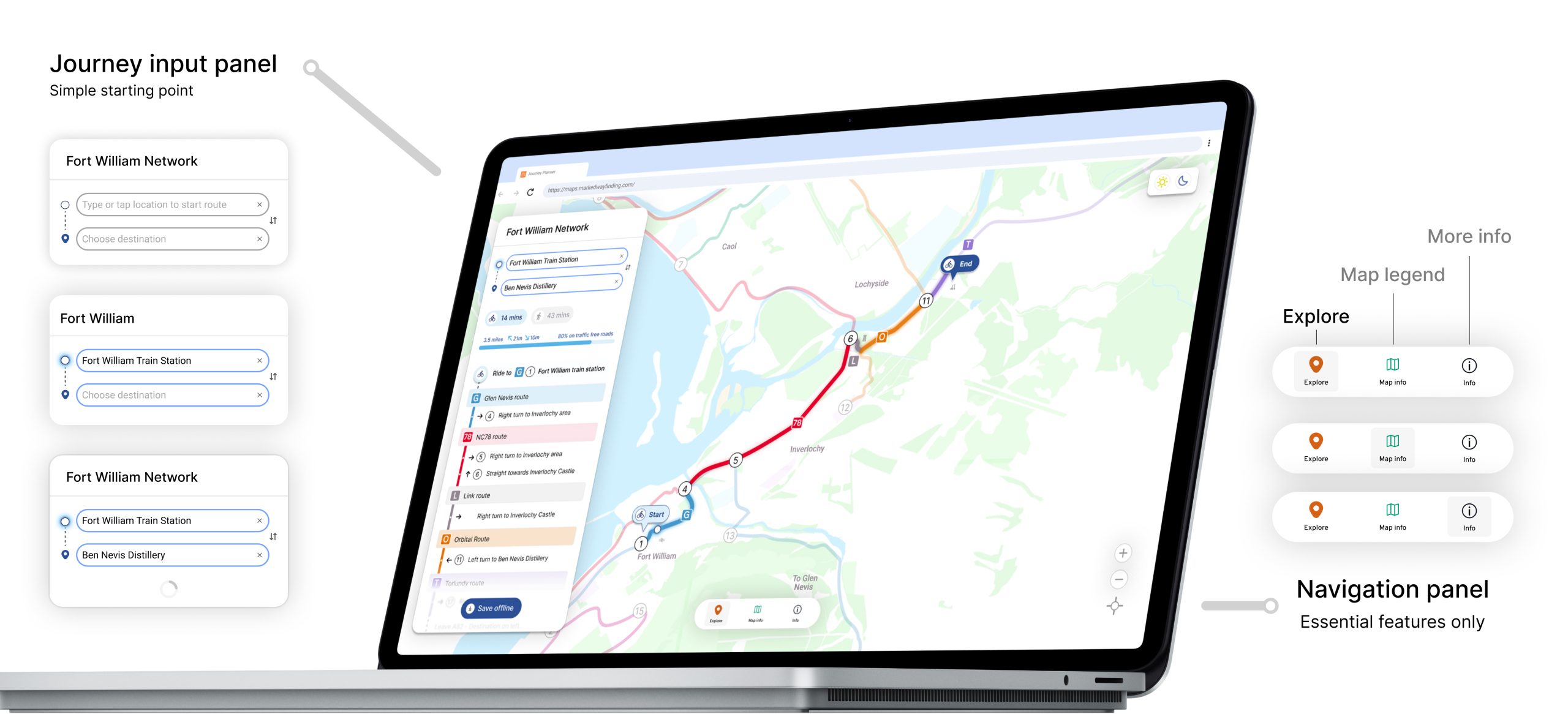
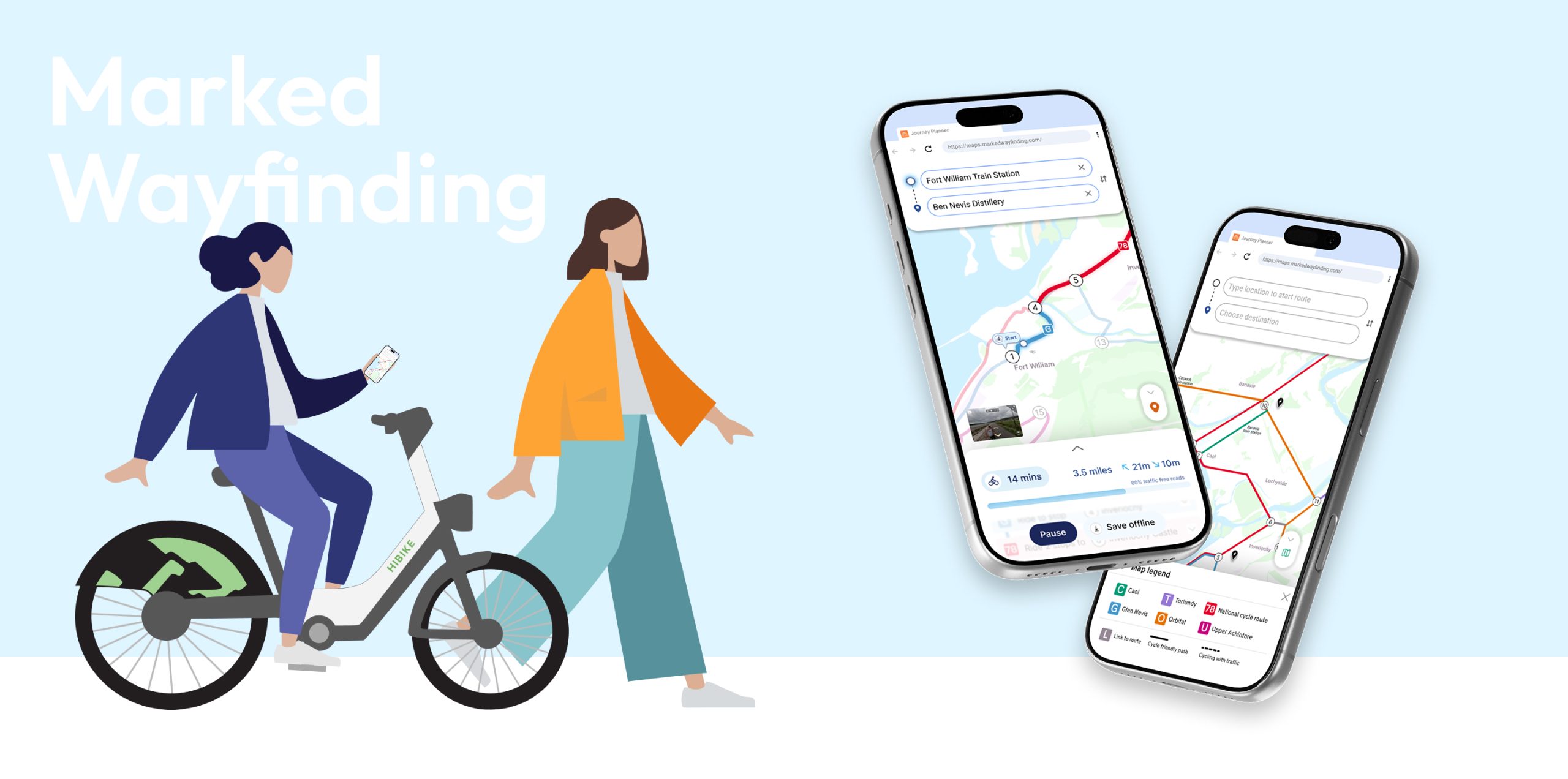
A responsive web route planner, using reliable data we collected, to ensure all the cycling and walking routes Fort William offers were safe and digitally accessible. The app has an intuitive and user-friendly interface with an innovative colour-coded wayfinding concept, making cycling and walking fun again. 

Approach

Discover

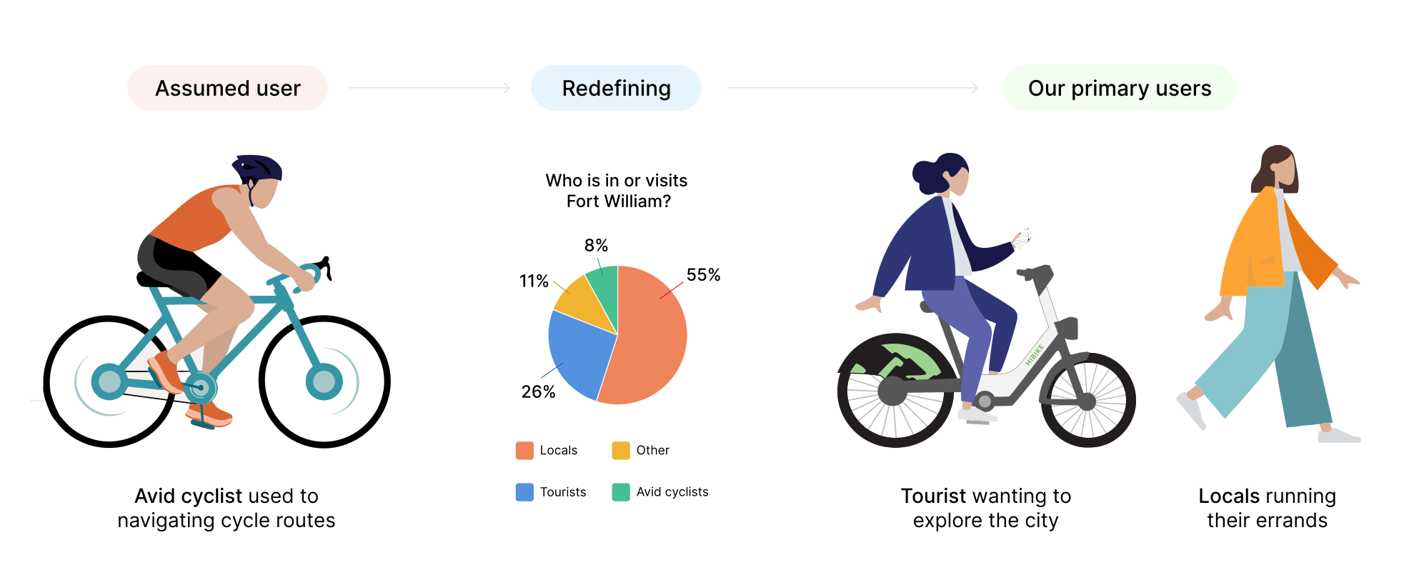
Redefining the users: The initial journey planner was being designed for experienced cyclists, which was a misassumed primary user.

From my further user interviews and survey results, I clarified that the Journey planner needed to be redesigned and refocused around the needs of tourists and locals.

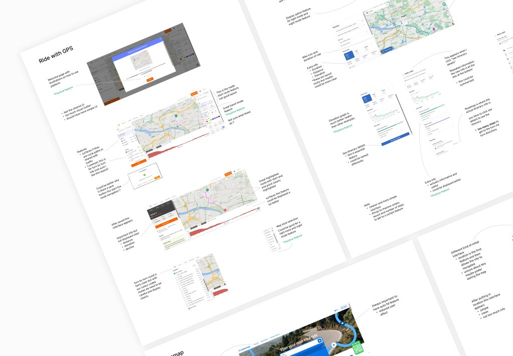
Analysing similar products: I analysed a range of similar route-planning products to break down key themes like their structure, essential planning features, direction logic, and page navigation.

This was an important step, as it helped me better understand the product I was designing and identify the key elements to focus on, which I later used to define the core requirements for the Journey Planner.

Define

Defining our user needs: After defining our primary users (Tourists & Locals), I conducted further research, such as, user interviews, to identify their key needs

App Simplicity

 Simple app features, easy to use and focused on making your cycling experience fun and safe

Clarity & Guidance

Clear directions that naturally guide users through the coloured and numbered cycling routes

Intuitive & Accessible

App should feel familiar, intuitive and user friendly for all users regardless of their cycling experience

Defining the focus: Building on our defined user needs and a product analysis of similar apps, I pinpointed the key focus areas for the redesign to make sure the product addressed those user needs

Making navigation simple

  • Map UI 
  • Navigation bar
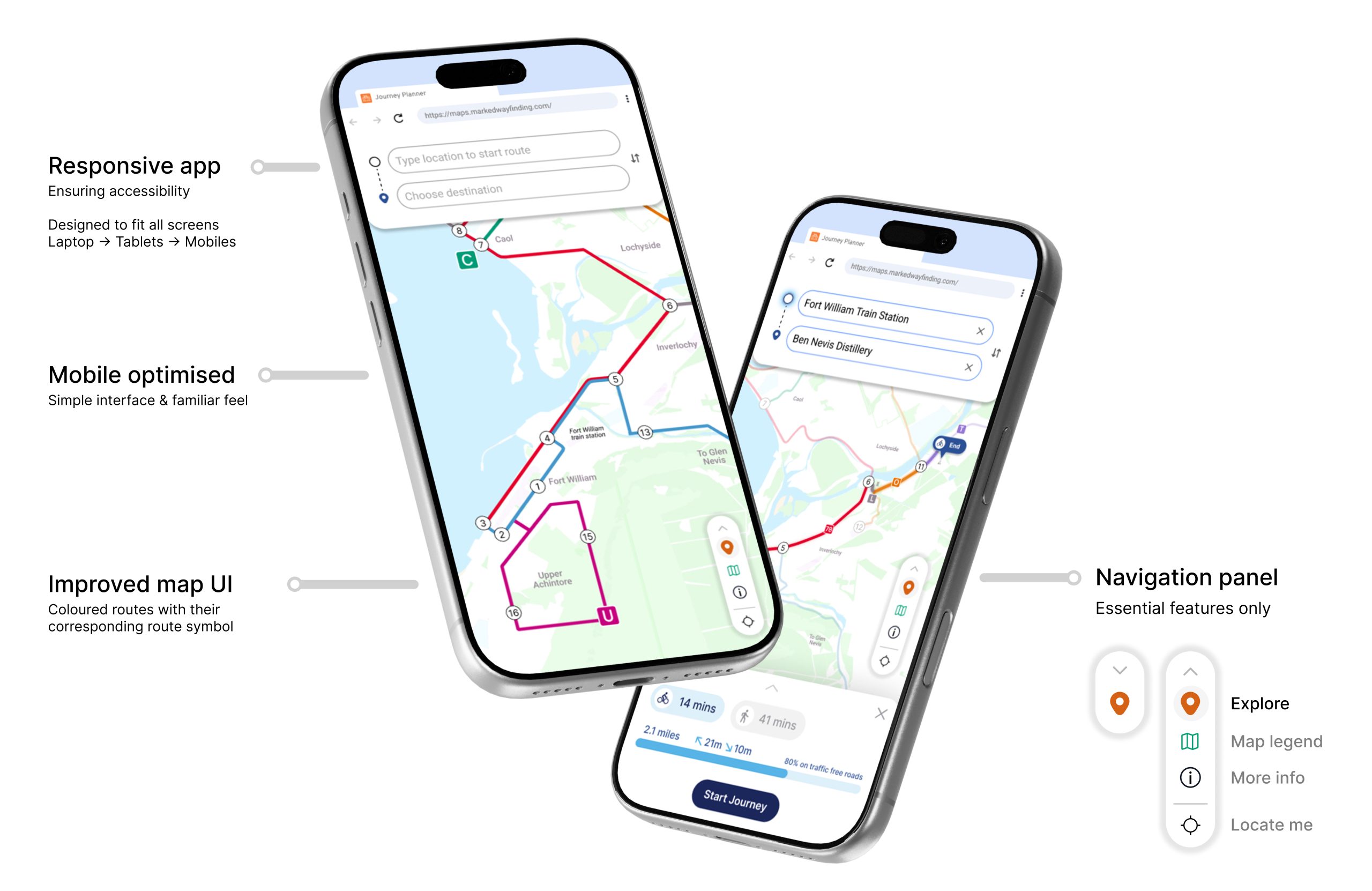
  • Mobile optimisation

Creating consistency

  • Design system 
  • Components 
  • Icons

Guiding the user

  • Onboarding 
  • Direction logic 

Ideate & Test

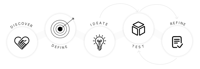
After defining those three focus areas, I moved into ideation. I took one focus area at a time, regularly tested and refined it using ongoing feedback to guide my design decisions and ensure the web app’s feautres met the user needs.

You can access my usability testing approach for this case study here, which goes into more detail about how I gathered user feedback to inform my design decisions in the Refine stage. 

Refine

The following showcases the refined focus areas, each one developed through ongoing testing, iteration, and real user feedback. 

Making navigation simple

App functionalities

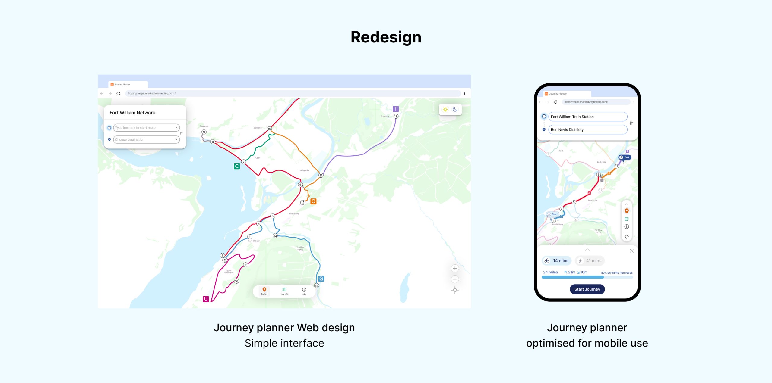
This stage of the redesign focused on improving the Journey Planner’s user interface. I designed the map to clearly showcase the coloured route network and node numbers, while also designing app components that made navigation easier and gave users an intuitive starting point.

Map UI

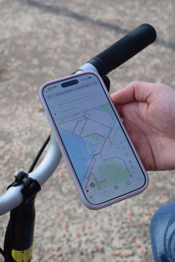
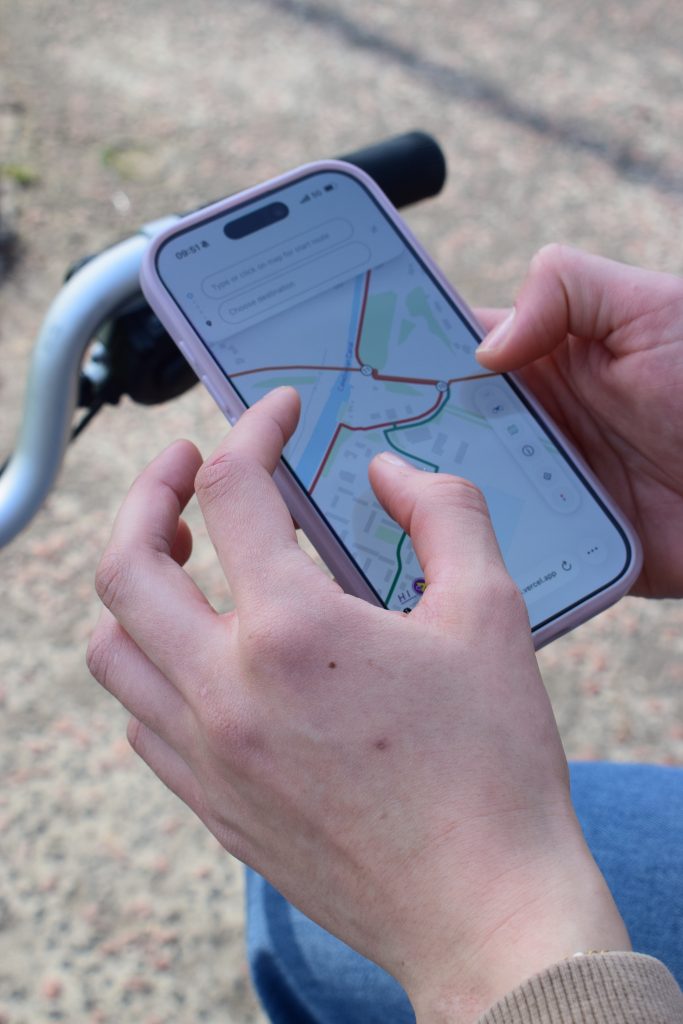
A metro-style map with more detail as you zoom in.

I styled the Fort William cycling network on Mapbox, editing the colours, the zoom-level detail, and the styling of the coloured routes and node numbers. The team later transitioned rendering to MapLibre and MapTiler, and deployed the app to Vercel.

Creating consistency

Click for full screen

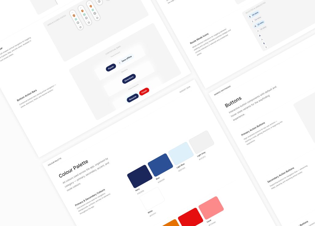
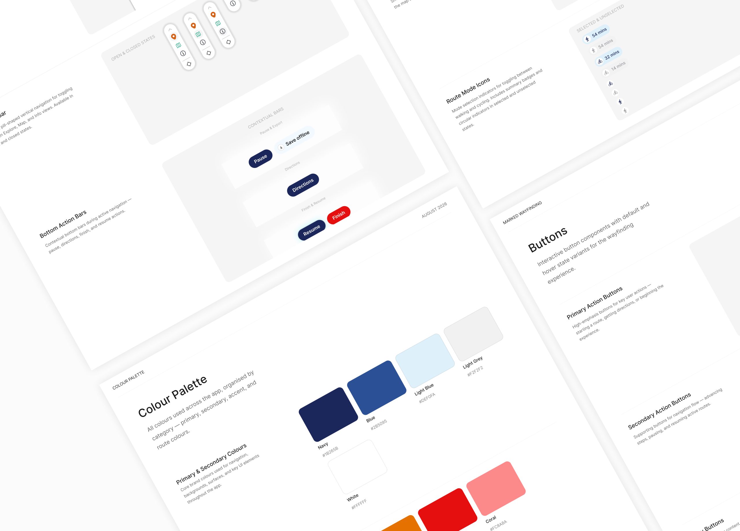
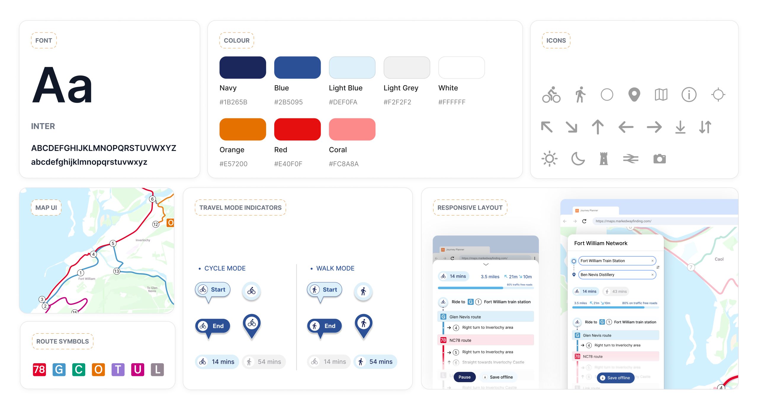
A key issue with the initial journey planner was its lack of consistency. While visually simple, inconsistent colours, buttons and UI elements made it difficult for users to understand how features worked and where to look.

I saw an opportunity to introduce a basic design system to create a consistent visual language, making the experience feel recognisable and intuitive to users while providing a consistent framework for both the front and back end development.

Guiding the user

on boarding ideation (1)

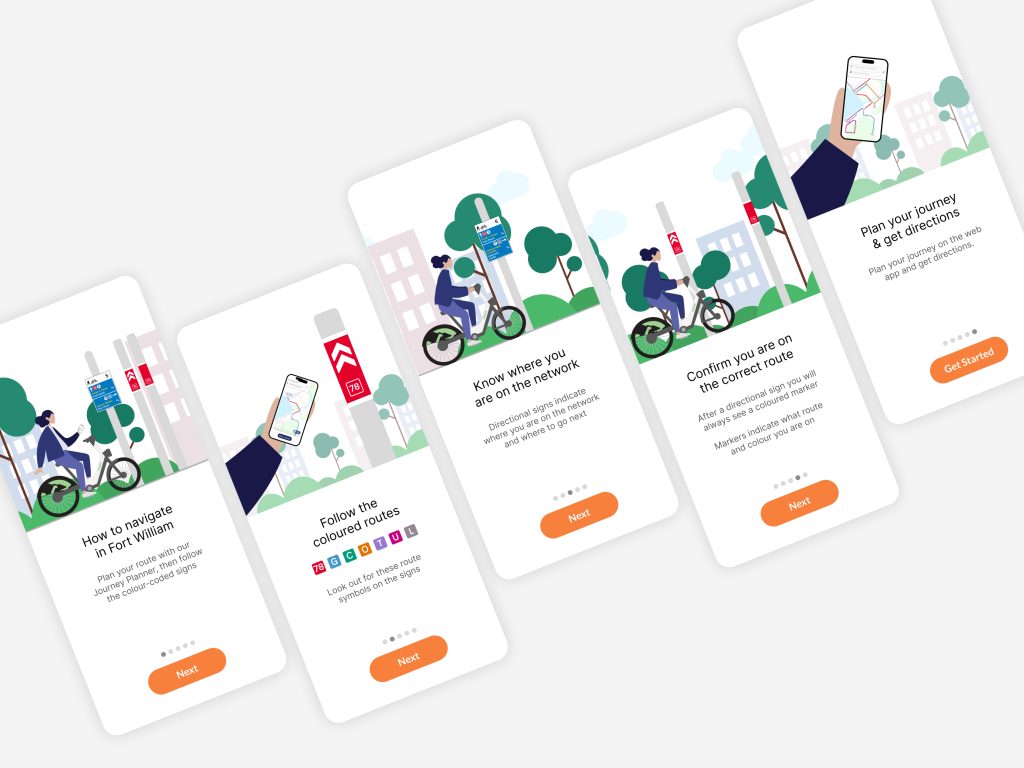
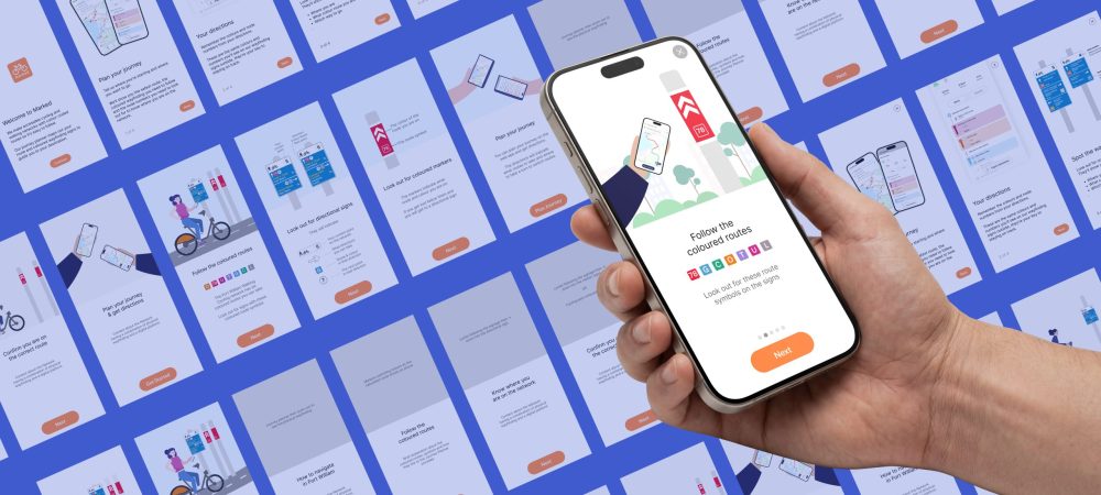
I anticipated users would need clear onboarding to understand how the physical wayfinding and the Journey Planner work together. Through several ideation sessions and concept tests, I explored different approaches before refining the experience into the following solution:

Outcomes

A user-friendly physical wayfinding system with an experimental colour-coded route approach, paired with a digital journey planner to provide users with an easier and more accessible way to navigate Fort William’s walking and cycling routes.

Project Name